

Ancillary task 2 (Poster)
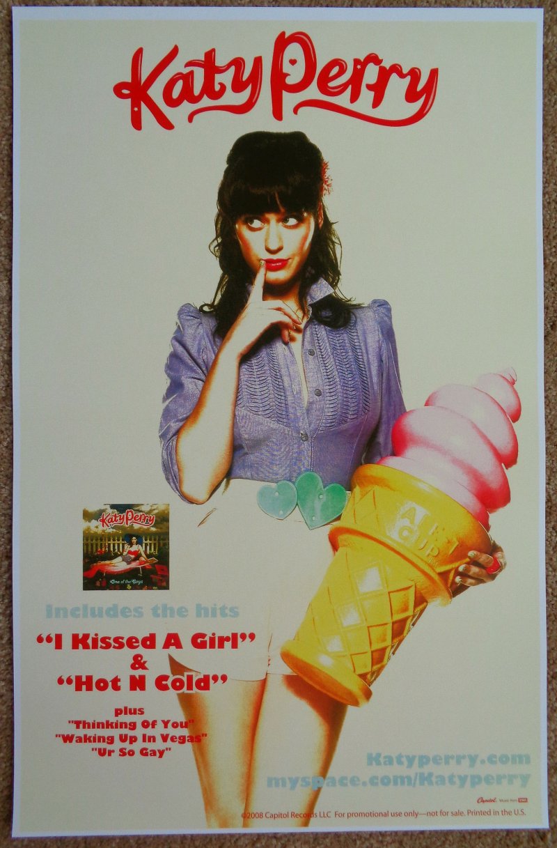
This poster overall has utilised the upbeat nature of the song to produce a bubbly music poster. Unlike some other posters, it has used as varied mixture of bright, enticing colours alongside the use of dominating objects on the poster. With this poster we can also get in implication into the genre of the song. From this, the poster seems quite girly and will have an audience aimed mainly towards girls and teenagers. Because of this, the bustling nature of the poster with the use of positive colours will attract this band of target audience. However to some, it may be seen as an eyesore with the mixture of colours.

Compared to the previous poster, the one above uses a dominated range of a plain dark background with some mild extremely bright colours specifically centred in the middle of the album cover. In addition, it has an even more simplistic nature throughout with only three main concepts to the cover: The Band name, the album name and facial features of the bands members. This would thus attract a different set of target audience to a much more matured, male focused audience where the song may have more meaning to it. Via this and the popularity of the well known band, they are more likely to buy the album as it simply gets to the point in it.

Another which differs from these in simplicity and uniqueness is the one above. This music poster strips to the basics- even without any parts of the band or narrative on it. Via this, it aims to give the band a sense of unpredictability to the bands nature, yet also a sense of meaning to a seemingly boring squiggly lines and the black and white colours. This once entices you to buy the album due to just the band name and opinions you have got from. The main criticism of this album poster is that it may be too simplistic. As we see from the others above, they utilise simplicity into their own ways to attract audiences, for example, by the use of bright colours or a portrait of the band. Due to this posters basic nature, it may not strike the hunger of the target audiences to buy the album, purely because it is not seen as aesthetically pleasing to look at.
Initial thoughts on Ancillary task 2:
Overall, I feel that the second analysed music poster would suit our music task the best- but instead of using the band use a part of the linear narrative. From the given basics, we need to produce a meaning on the poster that would strike and attract the target audiences while keeping the same simplicity throughout. This will blend the attractiveness of the poster without becoming too much to look at- either by too much information or too many contrasting colours.
How will your ancillary 1 and 2 have common themes?
It needs to be extremely similar to the album cover so that it can produce a marketing link. They both need to fit the emotional attachment (as said above) so that there are no contradictions, thus the audience not becoming confused. If they were also both similar- or in fact the same- then it will produce a more professional aspect that we aim to have, thus moving us another step up from just an A2 media piece.
0 comments: